Anyone Can Cook
I’m a product marketer. I understand how products are built, positioned, and why they succeed or fail. I can talk about a user journey, a go-to-market strategy, a conversion funnel. What I couldn’t do — until recently — was talk to an engineer in their language. Repos, branches, CLIs, deployments. I knew what these things did in broad strokes. I just couldn’t do them myself.
I’ve wanted a personal site for a while. Not a Substack. Not a Medium page with someone else’s logo on it. Something mine — that looked and felt the way I wanted it to. The vision was clear. The technical path to get there wasn’t.
The normal route would’ve been: research static site generators, pick one, follow a tutorial, get stuck on step 7, Google the error, find a Stack Overflow answer from 2019, realize it’s outdated, try a different tutorial. You know the loop. I’ve been in it before. Months of “learning” and nothing shipped.
I didn’t do that this time.
What I did instead
I opened Claude Code and said, roughly: I want to build a personal blog. Here’s the vibe. Let’s go.
Claude suggested Astro as the framework and Vercel for deployment. And here’s the thing — I didn’t just nod along. I asked what they were, why they made sense, what the alternatives were. Claude explained each one in terms I could actually map to what I already understood about products and infrastructure. Astro: a static site generator, great for content-heavy sites, fast by default. Vercel: deployment made simple, connects to GitHub, rebuilds the site automatically when you push changes. GitHub: the repo that holds everything together.
That conversation was the difference. Using Claude as a thought partner — to understand the tools, not just execute commands — meant I could actually make decisions. It wasn’t just “AI does the code, I watch.” It was a proper back-and-forth.
The first version looked rough. The second was better. The third started to feel like something.
The vision came first
Before I wrote a single word or touched any code, I knew what I wanted this place to feel like. Warm. Editorial. A little literary. I’d been collecting references for a while — sites, magazines, brands whose design I admired. Serif fonts. Cream backgrounds. Nothing that looks like it’s trying to sell you anything.
That matters more than people think. Having a clear picture of what you’re building means you can actually tell whether what’s in front of you is working or not. Without that, you’re just pushing pixels around and hoping something clicks.
Plussing
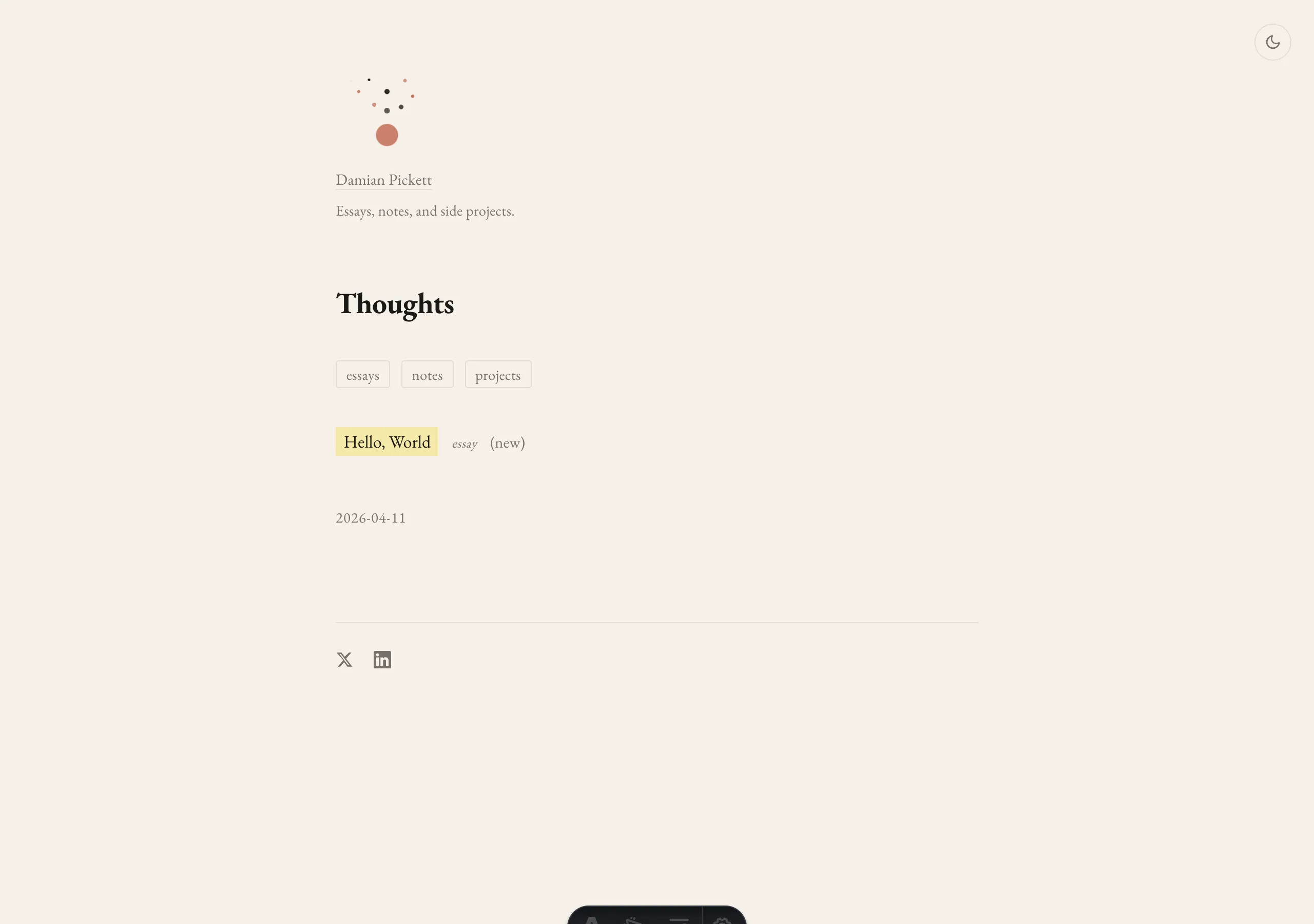
Walt Disney had this concept he called “plussing.” The idea is simple: take what you have, look at it, and ask what would make this a little better? Not a redesign. Not starting over. Just: what’s the next small thing that makes someone go, oh, that’s nice?
That became the whole process. We’d get something working, I’d live with it for a bit, and then we’d plus it.
The header got this animated illustration — little particles drifting upward from a central point, like loose thoughts. We went back and forth on the timing until it felt alive without being annoying.
The post pages got a table of contents that just sits there on desktop, quietly to the right, and tucks into a small button on mobile. Not in your face. Just there when you want it.
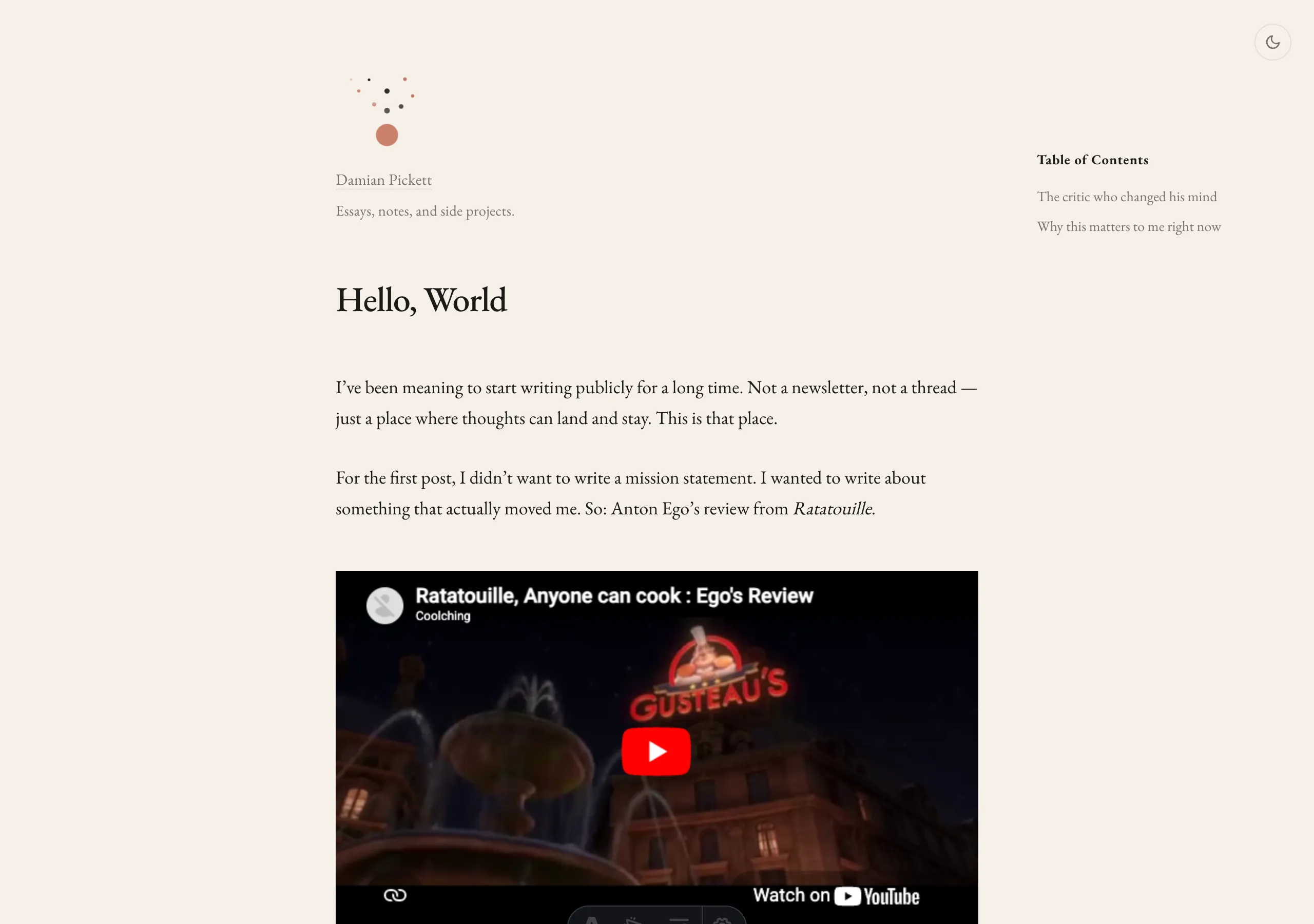
We added tags — essays, notes, projects — with these filter buttons at the top of the homepage. Small additions. Each one making the site feel a little more considered.
Dark mode. Typography tweaks. Responsive layouts so everything felt right whether you’re on a laptop or your phone.
The test was writing something real
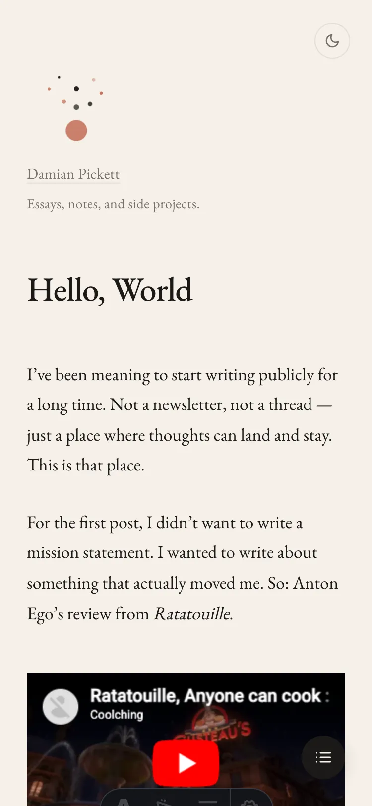
To see if the site actually worked, I needed real content. Not lorem ipsum. Something with substance — headings, images, blockquotes, a video embed — to stress-test the design and see how it held together when something real was sitting on it.
I wrote about Anton Ego’s speech from Ratatouille. It had been rattling around in my head for years anyway, and this felt like the right excuse. That piece stayed as a test article throughout the build — I’d load it up, scroll through it, notice what wasn’t quite right, go back and fix it. It did its job. It’s not live on the site, but it shaped everything that is.
The speech, if you haven’t seen it: Ego is the most feared food critic in Paris. He’s spent his career destroying restaurants. Then he eats a simple ratatouille — a peasant dish, made by a rat, in a Michelin-starred kitchen — and it stops him cold.
“Not everyone can become a great artist. But a great artist can come from anywhere.”
That line is why I wanted a blog. I needed somewhere to put thoughts like that. And the site had to be worthy of them — which meant it couldn’t look like a default template.
What surprised me
The collaboration wasn’t one-directional. I gave Claude direction as often as it gave me suggestions. It proposed Astro — I pushed back on color choices. It suggested a layout — I said no, simpler. It built a feature — I said actually, I don’t want that, try this instead.
You’re building together, and the person with the vision is driving. The tool doesn’t have taste. You do.
The site went through five or six major iterations across a handful of sessions. Each one started the same way: I’d look at what we had, notice what felt off, and say let’s fix this or let’s add that. No grand plan. No roadmap. Just: what would make this better right now?
My deep realisation
At first I was nervous about all of this. Where do I fit in? What’s my role here if the AI is writing the code? I started thinking about the people I look up to. Steve Jobs. Leonardo da Vinci. Walt Disney. Benjamin Franklin. Was I cheating myself by building this with AI when really it’s doing the dirty work for me?
But then it hit me. Everyone has always had tools. Walt Disney didn’t build Disneyland by himself. Jobs didn’t solder the first iPhone together with his own hands. Da Vinci had a workshop full of apprentices. Franklin had a printing press. The genius was never in the manual labour. It was in the vision. The taste. The why.
What’s different now is that everyone has access to these tools. Not just the people with engineering degrees or the budget to hire a team. Everyone.
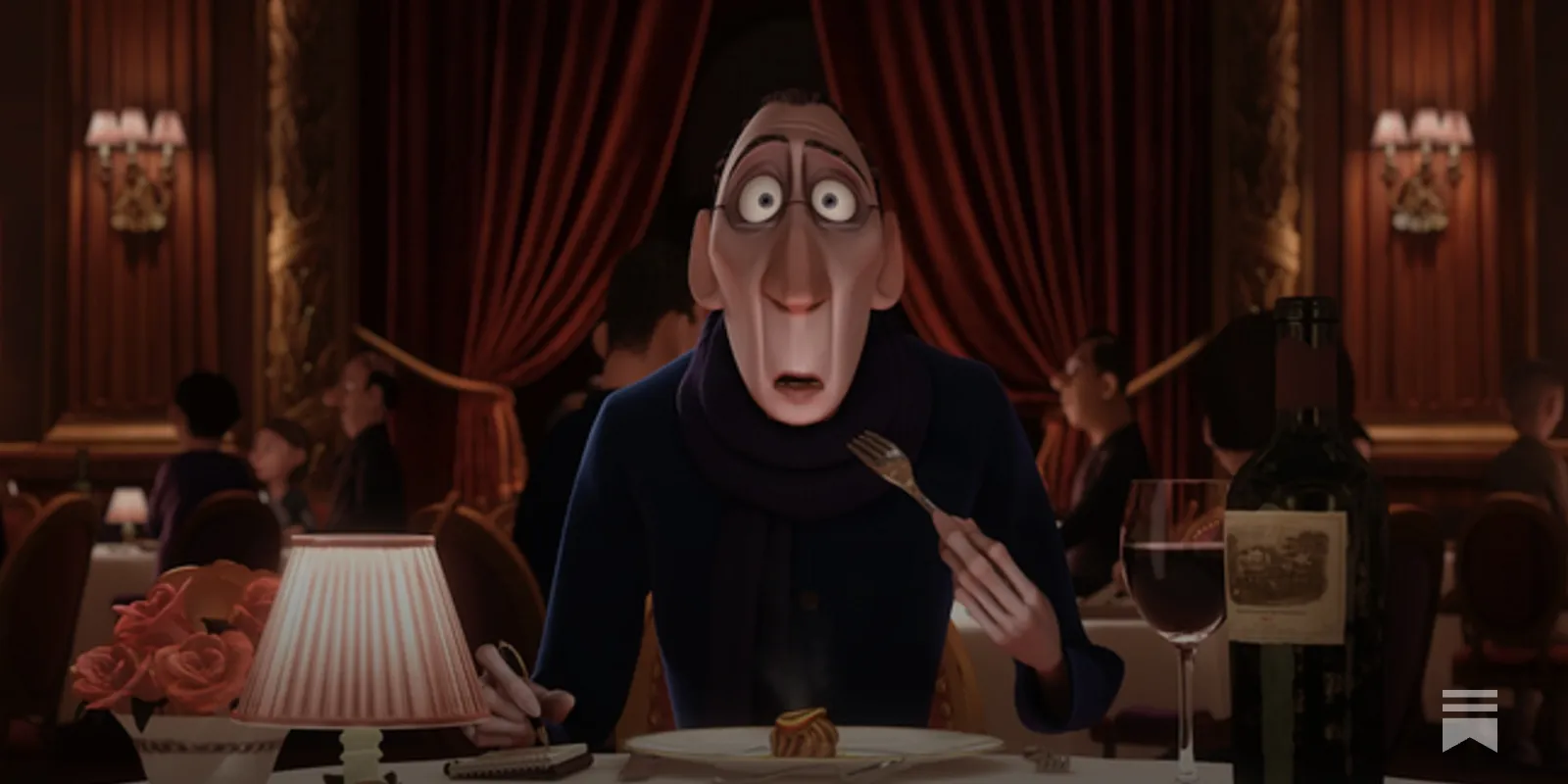
And that brings me back to Ratatouille. Back to Ego. Back to the line that started all of this.
“Not everyone can become a great artist. But a great artist can come from anywhere.”
Look — my little personal site is very, very basic compared to what real developers are building out there. I know that. That’s not the point. The point is I had a thought, I had a vision, and now it exists in the world. I built it. It’s here. You’re reading it.
The beauty is in the eye of the beholder. What do you want to build? Why do you want to build it? Is it something genuinely helpful to you or to someone else? That’s all that matters. That’s the whole thing.
Anyone can cook. Anyone can build. And it’s a beautiful world because of it.
Anyways — enjoy my little website project. More to come.